
_ascii.png)
I've seen a lot of landing pages over the past few years. Good ones. Bad ones. And the truly terrible ones, where you wonder if anyone ever really looked at them.
What I notice again and again: it's rarely a big design overhaul that makes the difference. It's usually the details. The clarity. The structure. The feeling of "I'm in the right place here".
Here are my 10 most important tips for more conversions – practical, honest and ready to use.
01. A CLEAR MESSAGE – NO CREATIVE CONFUSION
When I open a landing page, I want to understand within 3 seconds:
- What is this about?
- Who is it for?
- What's in it for me?
No wordplay. No cryptic headlines. No vague brand slogans.
A good headline is concrete. For example:
"Win 3–5 new clients per month with LinkedIn – without cold outreach."
That's clear. Concrete. Easy to grasp.
Creativity is good – but clarity converts.
02. ABOVE THE FOLD DECIDES EVERYTHING
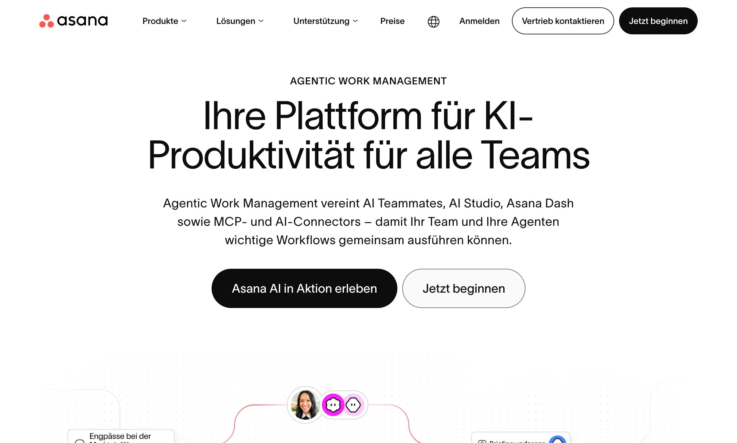
What do visitors see without scrolling? That's where it all gets decided: do they stay – or leave?
This area should always include:
- A strong headline
- A subheadline that spells out the benefit
- A clear call to action
- Optional: social proof or a visual element
No walls of text. No essays. Just the essentials.
The question I always ask myself: If someone only reads this section – do they understand the offer?
If not, there's still work to do.
03. FOCUS ON BENEFITS – NOT FEATURES
This is a classic – and yet it gets ignored all the time.
Nobody buys:
- 12 modules
- 4 bonus videos
- A 300-page PDF
People buy results.
Instead of: "12 video lessons"
Try: "Learn step by step how to set up your first profitable campaign."
Features inform. Benefits convince.
04. A CLEAR AUDIENCE – NOT "FOR EVERYONE"
A landing page that tries to appeal to everyone ends up appealing to no one.
If I write: "For entrepreneurs" → hardly anyone feels it's meant for them.
If I write: "For self-employed coaches who want to get regular client inquiries through LinkedIn" → suddenly it gets specific.
Clarity creates resonance. And resonance creates conversions.
05. SOCIAL PROOF – TRUST BEATS DESIGN
No matter how good your offer is: without trust, nobody will buy.
What works particularly well?
- Real testimonials with a photo
- Concrete results
- Screenshots of feedback
- Numbers (verifiable, if possible)
Important: Not "Great coaching, highly recommended!"
But: "After 6 weeks I had 4 new clients – without spending a cent on ads."
The more specific, the stronger.
06. FEWER CHOICES = MORE DECISIONS
Too many options paralyze people.
- 5 different packages
- 3 calls to action
- 4 different goals
That's overwhelming.
On a classic landing page, I recommend:
- One goal
- One primary CTA
- One clear action
People decide more easily when they don't have to compare.
07. A CALL TO ACTION THAT ACTUALLY GUIDES
"Submit" is not a convincing CTA.
A good call to action:
- Uses active language
- Highlights the benefit
- Sounds clear and specific
Examples:
- "Book your free strategy call"
- "Reserve your spot in the workshop"
- "Download the free checklist"
And this is important: your CTA can appear several times on the page. Not just once at the very bottom.
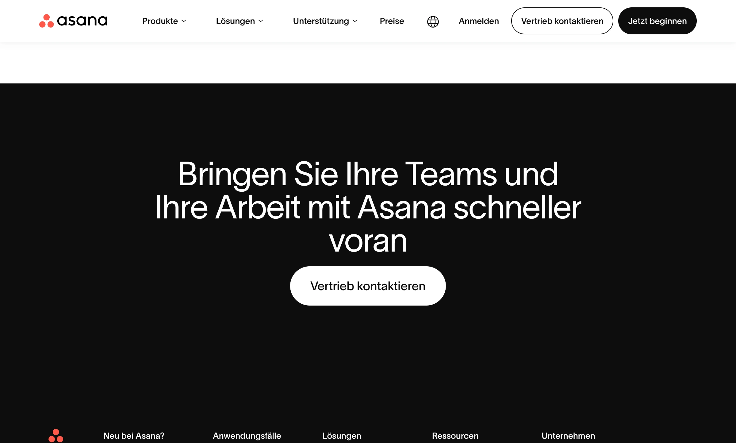
08. ADDRESS OBJECTIONS UP FRONT
Every buying decision comes with some inner resistance.
Typical thoughts:
- "Is this legit?"
- "Will this work for me?"
- "Is it worth the money?"
- "What if it doesn't work out?"
A good landing page actively answers these questions. For example with:
- An FAQ section
- A money-back guarantee
- Transparent pricing
- A clear explanation of the process
When I can tell that someone understands my doubts, I automatically trust them more.
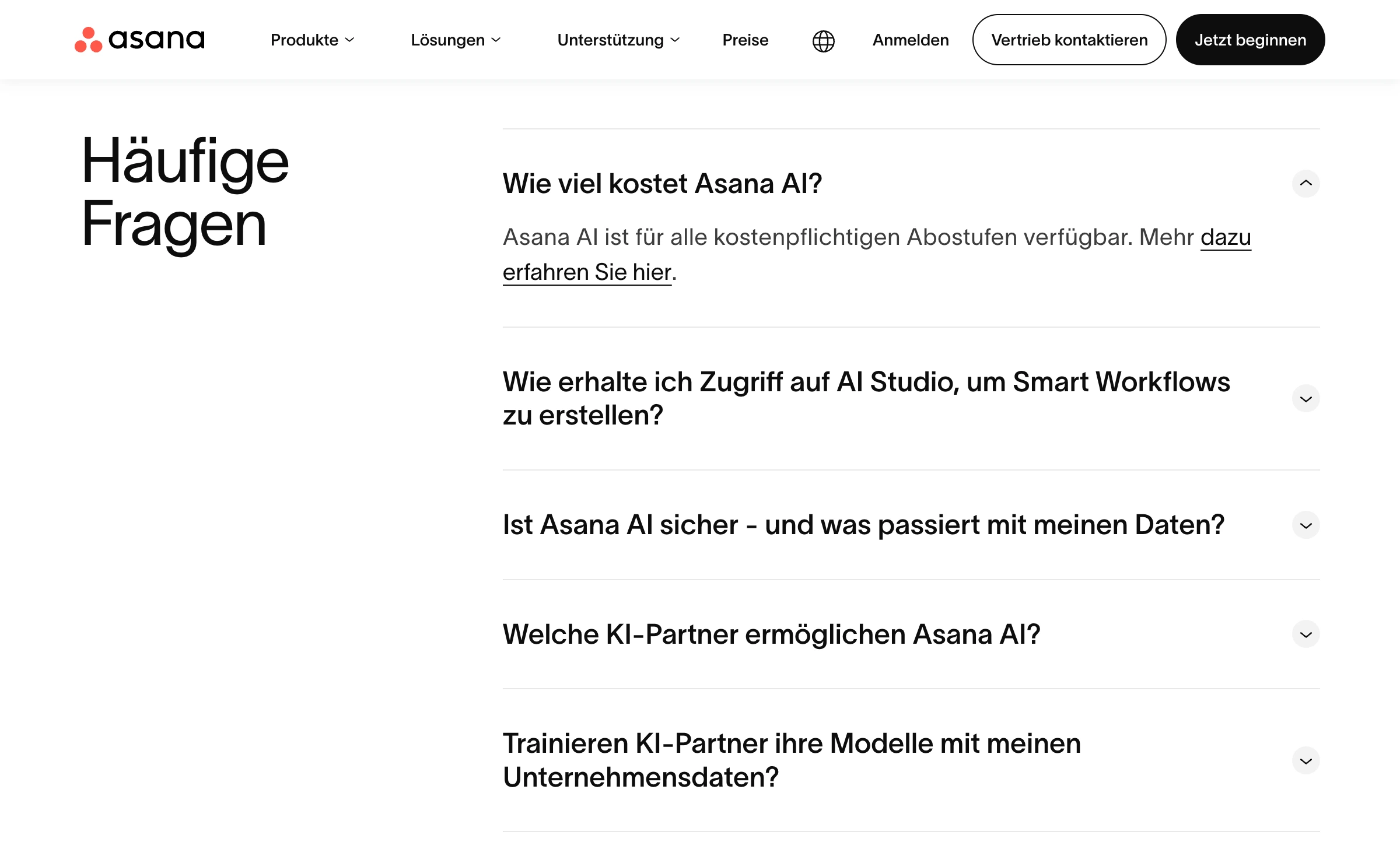
09. STRUCTURE BEATS WORD COUNT
Many people believe a long landing page is automatically better. Length isn't the problem. Unstructured text is.
What matters:
- Clear subheadings
- Short paragraphs
- Bullet points
- White space
- Visual guidance
A well-structured long page can convert extremely well – because it guides the reader. A short, chaotic page can fail completely.
Readability is conversion optimization.
10. TEST. REALLY TEST.
This might be the most important point.
Here's what I've seen:
- A small headline change → +30% conversions
- A different button color → barely any difference
- Testimonials moved higher up → clearly better results
What does that mean for you?
Don't guess. Test.
For example:
- A/B tests on headlines
- Different CTA wording
- Different ways of presenting the offer
- The order of your arguments
Often it's the small details that make the difference.
BONUS: THE ONE QUESTION THAT CHANGES EVERYTHING
When I optimize a landing page, I always ask myself this question:
Would I buy here – if I were the target customer?
If the honest answer is "no", I know there's still friction. Still uncertainty. Still a lack of clarity. And that's usually exactly where the biggest opportunity is.
11. CONCLUSION: CONVERSION IS NOT A TRICK – IT'S CLARITY
More conversions don't come from psychological manipulation, complicated hacks or secret copywriting formulas.
They come from:
- Clarity
- Relevance
- Trust
- Structure
- Focus
In the end, it's not about design or copy alone. It's about how your page makes people feel.
- Do they feel understood?
- Do they feel safe?
- Does the decision feel logical and easy?
If so, conversions go up almost automatically.
Now be honest: Which three things would you improve on your current landing page right away? Sometimes that first small step is all it takes.